Photography is more than capturing a moment—it is about conveying emotion, mood, and story. Have you ever looked at a photo and felt instantly moved by its colors? One of the most powerful tools photographers have is color, and understanding color psychology in photography can transform ordinary snapshots into emotional works of art.
What is Color Psychology in Photography?
Color psychology explores how colors influence our emotions, behavior, and perceptions. In photography, it goes beyond aesthetics. It’s a way to communicate feelings and guide the viewer’s reaction to an image. While color theory focuses on combinations, color psychology emphasizes emotions.
How Colors Affect Emotions in Photography
Here’s a breakdown of some common color associations:
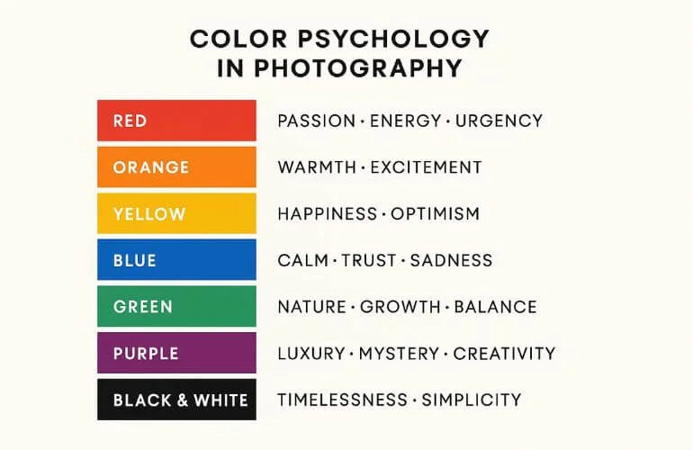
| Color | Emotion/Meaning |
| Red | Passion, energy, urgency |
| Orange | Warmth, excitement |
| Yellow | Happiness, optimism |
| Blue | Calm, trust, sadness |
| Green | Nature, growth, balance |
| Purple | Luxury, mystery, creativity |
| Black and White | Timelessness, simplicity |
These meanings can vary across cultures, but they serve as a useful guideline when planning your shots. By carefully choosing colors, photographers can set the mood before the viewer even processes the subject. Learn more about how colors influence emotions from Verywell Mind.
Beyond influencing emotions, colors also help tell stories and guide how viewers interpret a scene. Understanding how colors interact within a frame is crucial for storytelling. Our article on Color Composition in Photography explores how to plan shots for maximum emotional impact.
The Role of Color in Storytelling

Color is a key part of storytelling. Think about your favorite movie scene—did the colors make you feel suspense, joy, or calm? It guides emotions and sets the scene’s mood. Warm colors like red, orange, and yellow can show energy, passion, or danger. Cool colors like blue and green can show calmness, sadness, or mystery.
Colors can also give meaning to characters or events. For example, one color might be linked to a character’s personality or journey. Filmmakers and writers use color to guide the audience’s attention and make the story feel more real.
In short, color is not just for beauty. It is a powerful method to evoke emotions, enhance understanding, and foster a connection with a story.
Lighting & Environment in Color Perception
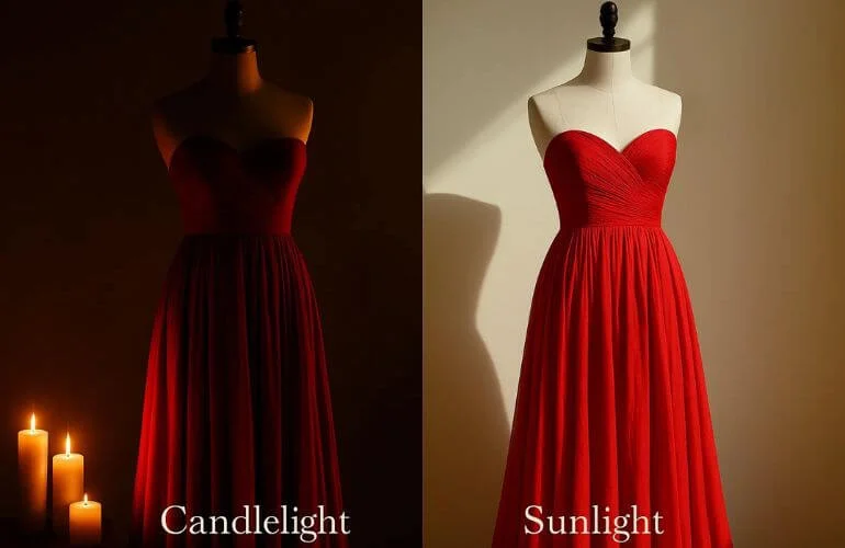
Lighting changes how we see colors. Natural sunlight makes colors look bright and true, while artificial light can make them appear warmer or cooler. For instance, a red dress may look soft under candlelight but bold in direct sunlight. At sunset, everything takes on warm golden tones. On cloudy days, colors often appear muted and less vibrant.
The environment around a color also affects how we see it. Next to white, a blue wall appears brighter; next to black, it looks darker. Neon lights in a city can make colors appear intense and dramatic, while earthy tones in nature can make the same colors feel calm and balanced.
Photographers and filmmakers use lighting and environment carefully to control how colors are perceived. This helps them set the mood, highlight subjects, and guide the viewer’s emotions. Understanding how lighting and surroundings affect color perception is essential before applying color psychology in your own photography.
How to Apply Color Psychology Effectively
To use color psychology well, start by knowing your audience and the feelings you want to create. Then pick colors that match your goals. Keep cultural meanings in mind, and test your choices before finalizing your palette.
To use color psychology effectively, follow these key steps:
Step 1: Understand Your Audience and Goals
To use color effectively, first understand your audience. People perceive colors differently based on age, culture, and environment. For instance, young audiences may prefer bright, bold colors, while older audiences often favor softer, muted tones.
Next, decide the mood you want to create. Playful designs might use yellow and orange, while professional or formal settings may benefit from blue or black.
Finally, consider cultural differences, as colors can have different meanings across the world. Researching how your audience perceives colors ensures your design communicates the intended message.
Step 2: Choose Colors Strategically
Once you understand your audience, it’s time to choose colors strategically. For a balanced design, follow the 60-30-10 rule: 60% main color, 30% secondary, and 10% accent.
The color wheel is a helpful tool for selecting colors that work well together. Complementary colors (opposite each other) create strong contrast, while analogous colors (next to each other) blend for harmony. Check out our guide on the Adobe Color Wheel.
Finally, test different color combinations to see which ones look best and align with the mood you want to create. Experimentation ensures your palette communicates your intended emotion effectively.
Step 3: Test and Refine
After selecting your colors, it’s important to test and refine them to ensure they achieve the desired effect. Tools like color palette apps or A/B testing can help you gauge how your audience reacts.
Keep in mind that colors can look different depending on the lighting or device. Always check your palette in natural sunlight, indoor lighting, and on screens to see how it appears in various environments.
If you’re uncertain, start with small accents before applying changes to the entire design. While keeping up with color trends can make your work feel fresh, timeless colors are always a safe and effective choice.
Step 4: Accessibility and Inclusivity
Ensure your design is accessible and easy for everyone to understand. Use sufficient contrast between text and background so all content is readable. Avoid relying on color alone to convey information.
Adding icons, patterns, or labels helps people with color blindness interpret your designs correctly. Whenever possible, allow users to customize color settings according to their preferences to make your content more inclusive.
Step 5: Specific Applications
Colors can be applied in many ways to guide attention and create the right mood. In email marketing, for example, use color to highlight buttons and important links. In digital learning environments, choose colors that help learners focus without causing distraction.
For home design, light colors can make small spaces feel larger, while bold colors highlight specific features. In offices or retail spaces, carefully selected colors can boost productivity and create a welcoming atmosphere.
Common Mistakes to Avoid
- Ignoring Color Theory: Not using colors to convey emotion reduces impact.
- Clashing Colors: Conflicting colors distract rather than enhance the mood.
- Wrong White Balance: Colors look unnatural if the white balance isn’t correct.
- Bad Lighting or Exposure: Poor lighting changes the mood and alters colors.
- Blurry or Out-of-Focus Images: Sharpness is essential for colors to stand out.
- Busy or Cluttered Backgrounds: Backgrounds can compete with your subject.
- Neglecting Post-Processing: Skipping editing may lead to inaccurate or dull colors.
- Inconsistent Color Style Across Photos: Differences in color style confuse viewers.
- Oversaturation or False Contrast: Too much color or contrast makes photos look fake.
- Limited Shots Taken: Fewer photos reduce the chances of capturing the perfect color and mood.
Case Studies & Examples
Sunset Portrait: Warm orange and red tones evoke intimacy and passion.

Forest Landscape: Shades of green create tranquility and connection with nature.

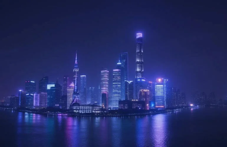
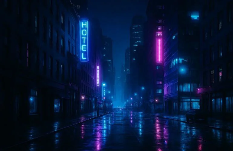
Urban Night Scene: Blue and purple tones convey mystery and calm in cityscapes.
Final Thoughts on Color Psychology in Photography
Understanding color helps you tell stories and evoke emotions. Careful use of colors, lighting, and edits makes your photos more memorable. Next time you pick up your camera, observe and use colors intentionally—they can transform the mood and story of your photos.
Color Psychology in Photography: Key Insights
- Colors in photography evoke specific emotions and influence viewers’ perceptions.
- Warm colors (red, orange, yellow) often convey energy, passion, or excitement; cool colors (blue, green) suggest calmness, sadness, or balance.
- Lighting and environment affect how colors appear and the mood they create.
- Understanding your audience and testing color choices ensures the intended emotional impact.
- Accessibility and inclusivity are important—use contrast, labels, and alternatives for color-dependent information.
- Thoughtful use of color enhances storytelling and strengthens the connection with your audience.
Top FAQs on Color Psychology in Photography
Red, because it evokes passion, love, and urgency.
They consider the mood, subject, lighting, and emotional impact.
No, contrast, brightness, and tone in monochrome images still influence mood.
Beginners can start by observing natural light, experimenting with clothing or background colors, and using simple free tools like Canva or basic editing apps to test color combinations.
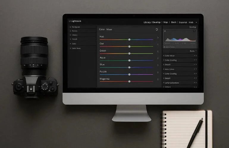
Popular tools include Adobe Photoshop, Lightroom, Capture One, and Affinity Photo. These allow precise control over hue, saturation, contrast, and tone to create the desired emotional effect.