

When customers shop online, they cannot physically inspect products. They rely on product images to understand what they will receive. Color becomes especially important when products come in different shades or finishes.
For example, a shopper may see an olive green shirt online. But the delivered shirt could look bright lime green. The product may not be defective, yet the color difference can create an expectation gap. A noticeable mismatch can lead to disappointment, complaints, exchanges, or returns.
For ecommerce sellers, accurate product colors help set clearer expectations. Shoppers get a more realistic idea of what they will receive. This is why ecommerce product color accuracy matters. It helps product images represent the actual item more faithfully. This guide explains why colors change online and how businesses can improve color accuracy.
What Is Ecommerce Product Color Accuracy?
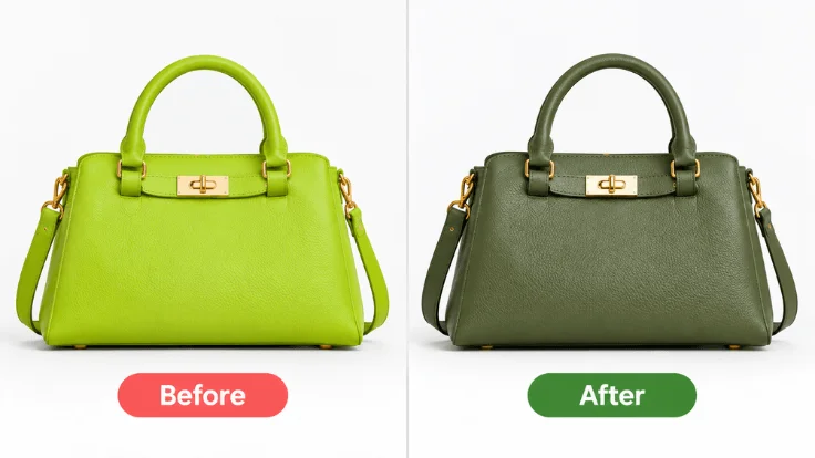
Ecommerce product color accuracy means how closely a product image matches the actual product color. Accurate images represent the product’s real color as closely as possible. This gives customers a more realistic view of what they are buying. The goal is to minimize misleading color differences between the product image and the physical item. Professional color correction can help improve color accuracy and reduce unwanted color differences.
Product Color Accuracy vs. Creative Color Editing
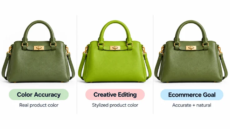
Product color accuracy focuses on faithful product representation. The goal is to show the product as it actually looks. Creative color editing has a different purpose. It may change colors, tones, or contrast to create a specific visual style.
For ecommerce, color edits should not make products look misleading. Professional color correction fixes unwanted color shifts while preserving the product’s natural appearance.
Why Does Product Color Accuracy Matter in Ecommerce?
Product color is a key part of the buying decision. Customers use product images to judge colors before ordering. Accurate colors give them a clearer understanding of what they will receive.
Sets Accurate Customer Expectations
Product images create a visual expectation before purchase. When colors closely match the real product, customers get a more realistic preview. This is especially important for products where color affects the buying decision. Accurate images help shoppers understand the product before placing an order.
Helps Customers Choose Between Similar Colors
Some product colors can look very similar on screen. Navy can appear close to black. Cream can look like white. Olive can appear closer to lime under certain lighting. Accurate color helps shoppers distinguish between these shades. This makes product images more useful during the buying process.
Protects Product And Brand Presentation
Color accuracy also matters across an ecommerce product catalog. Product images should represent each item without misleading color changes. Consistent and accurate colors create a more reliable product presentation. They also help brands maintain a consistent visual standard across product images.
How Color Mismatch Creates Ecommerce Product Returns
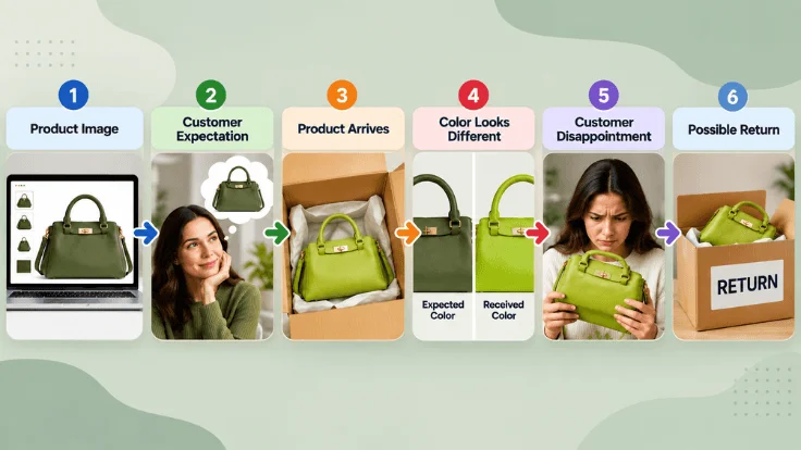
A color mismatch can create a gap between expectation and reality. Customers choose products based on the images they see online. When the delivered product looks noticeably different, their expectations may not match the actual item.
The Ecommerce Color Expectation Gap
The process usually follows a simple pattern:
Product Image → Customer Expectation → Product Arrival → Color Difference → Disappointment → Possible Return
First, the customer sees the product image online. The image creates an expectation about the product’s appearance. Next, the customer receives the physical product. If its color looks noticeably different, the customer may feel that the product does not match the listing.
This difference can create disappointment. Depending on the situation, the customer may request an exchange, contact the seller, or return the product.
What Happens When the Product Looks Different?
A noticeable color difference can affect how customers perceive the purchase. The product may be technically correct, but it may not look like the customer expected. Customers may describe the issue as “not as pictured.” They may also question the product listing or contact customer support.
For sellers, this can create additional handling work. Exchanges, refunds, support requests, and returned inventory can also add operational costs. The issue is not always caused by the physical product. Problems can occur during photography, editing, publishing, or color display.
Real-World Color Mismatch Examples
Small color differences can matter when shoppers compare similar shades.
- Olive vs. lime: A muted olive product may appear much brighter online.
- Navy vs. black: A dark navy item may lose its blue tone in an edited image.
- Cream vs. white: Warm lighting can make a cream product appear nearly white.
- Gold vs. yellow: Incorrect white balance can make metallic gold look more yellow.
These differences can change how customers understand the product. Accurate color representation helps reduce the gap between the product image and the physical item.
Improve product colors with professional ecommerce color correction.
Explore More →Why Do Product Colors Look Different Online?
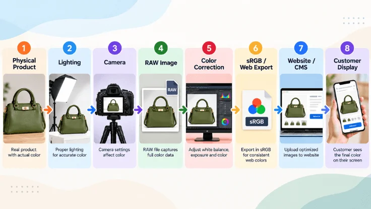
Product color can change at several stages before customers see it. The main stages include capture, editing, publishing, and viewing.
The complete color pipeline is:
Physical Product → Lighting → Camera → RAW/Image → Editing → Color Profile → Website/CMS → Customer Screen
Capture Stage
The capture stage includes the product, lighting, and camera. Poor lighting can create color casts or uneven tones. White balance and camera settings can also affect recorded colors. Consistent lighting and careful camera settings create a more accurate starting image.
Editing Stage
Editing can improve product images, but excessive adjustments can change colors. Changes to hue, saturation, exposure, or color channels may create unrealistic results. Unwanted color casts can also remain without proper correction. Color correction should improve accuracy without changing the product’s natural appearance.
Publishing Stage
After editing, the image moves into the publishing workflow. This includes exporting, setting a color profile, uploading, and website processing. Incorrect export settings can affect how colors appear online. A consistent web color workflow helps preserve the intended appearance.
Viewing Stage
Customers may view product images on different phones, tablets, laptops, or monitors. Display settings and screen characteristics can affect how colors appear. Sellers cannot control every customer’s display. However, they can provide properly corrected images using a consistent web color workflow.
A product’s color can change at several points in the workflow. Photography, editing, publishing, and screen display can all affect the final appearance.
Color Accuracy vs. Color Consistency: What’s the Difference?
These two concepts, color accuracy and color consistency, work together. But they are not the same. Color They serve different purposes in ecommerce.
| Concept | Main Purpose |
|---|---|
| Color Accuracy | Match the real product |
| Color Consistency | Keep product images visually uniform |
| Color Grading | Create a creative visual style |
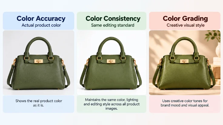
Color accuracy focuses on matching the physical product’s appearance. The goal is to represent its actual color as closely as possible. Color consistency keeps product images visually uniform across a catalog. This is useful for brands with many products or color variations.
Color grading has a different purpose. It creates a specific visual mood by changing tones, contrast, or colors. For ecommerce, product accuracy should remain the priority. Product images should remain faithful to the actual product while following a consistent visual standard.
Why Ecommerce Needs Both Accuracy and Consistency
An ecommerce image should accurately represent its product. At the same time, product images should follow a consistent visual standard across the catalog.
The goal is not to make every image identical. Instead, brands should maintain a unified presentation while preserving each product’s actual appearance. For a deeper comparison, see our guide to Color Correction vs. Color Grading.
How Professional Color Correction Improves Product Color Accuracy
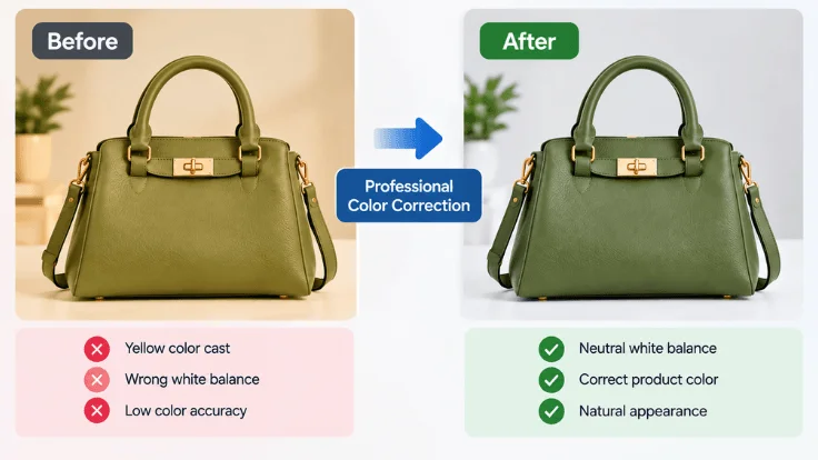
Professional photo color correction helps product images stay close to the actual item. It focuses on fixing unwanted color shifts while preserving the product’s natural appearance.
Correcting White Balance
White balance correction removes unwanted warm or cool color shifts. It helps neutral colors appear more natural in the final image. This is especially useful when lighting conditions affect the original photograph. Correct white balance creates a reliable starting point for further adjustments.
Removing Unwanted Color Casts
A color cast can make an image appear slightly tinted. Common examples include yellow, blue, green, or red shifts. Color correction can reduce these unwanted tones. This helps the product’s original color appear more natural.
Adjusting Hue and Saturation
Hue controls the basic color appearance, while saturation controls color intensity. Small adjustments can bring product colors closer to the physical item. Over-saturation can make products look brighter or more vivid than they really are. Professional correction keeps these adjustments controlled.
Balancing Highlights and Shadows
Highlights and shadows can affect how product colors appear. Excessive highlights may wash out lighter colors, while deep shadows can make darker colors look different. Balancing these areas helps preserve important color details. It also creates a more even representation of the product.
Matching Product Colors to References
A physical product, color swatch, or approved reference image can guide the correction process. Editors can compare the image against the reference and adjust visible differences. This approach is useful when accurate product colors are important. It helps keep the final image closer to the intended product appearance.
Keeping Multiple SKUs Consistent
Brands often sell the same product in several colors or variations. Each image should represent its specific color while following the same editing standard. Professional color correction can help align white balance, tones, and overall treatment across a catalog. This creates a uniform presentation without making different products look identical.
For brands that need ecommerce color correction at scale, professional photo color Correction Service can help correct color shifts, improve product photo color accuracy, match product colors, and maintain consistent image quality across large catalogs.
Get accurate, consistent product colors with professional color correction.
Start Free Trial →How to Improve Ecommerce Product Color Accuracy
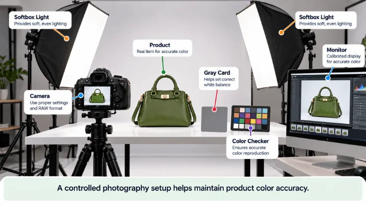
Accurate product photos start with a controlled workflow. Small improvements during shooting, editing, and publishing can help preserve product colors.
Use Consistent Product Lighting
Use the same lighting setup when photographing similar products. Keep the light direction, intensity, and color temperature consistent. Avoid mixing different light sources when possible. Product color consistency helps brands maintain a uniform catalog appearance.
Shoot in RAW When Possible
RAW files preserve more image information than compressed formats. They also provide greater flexibility during color correction. This can help you adjust white balance, exposure, and color without making aggressive changes to the original image.
Use a Color Checker or Gray Card
A color checker provides a reference for correcting color during editing. A gray card can also help establish a neutral white balance. Place the reference under the same lighting as the product. This gives you a more reliable starting point for color adjustments.
Calibrate Your Editing Monitor
Your monitor affects how you judge colors during editing. An uncalibrated display can make colors appear warmer, cooler, brighter, or darker than intended. Use a properly calibrated monitor when accurate color matters. Recalibrate it regularly to maintain a consistent editing environment.
Use a Consistent Color-Correction Workflow
Apply the same basic correction process to similar product images. Check white balance, exposure, color casts, hue, and saturation before making creative adjustments. A consistent workflow makes it easier to maintain accurate colors across large product catalogs.
Export Web Images in sRGB
sRGB is commonly used for images displayed on the web. Using a consistent web color workflow can help reduce unexpected color differences during online delivery. Check your export settings before uploading product images. Avoid changing color workflows between editing and publishing without a clear reason.
Check Images on Multiple Devices
Review final images on different screens when possible. Check them on a desktop monitor, laptop, and mobile device. This can reveal obvious color shifts that may not be noticeable on your primary editing screen. It cannot make every display identical, but it can help identify major issues.
Compare Final Images With the Physical Product
The final image should be compared with the actual product whenever possible. Check important colors under suitable lighting before publishing. Look for obvious differences in hue, brightness, saturation, and color temperature. Make final corrections before the image goes live. A simple final check can help catch color problems that earlier editing steps may miss.
Which Ecommerce Products Need the Most Color Accuracy?

Ecommerce color accuracy matters across ecommerce, but some products depend more heavily on color. Small differences can change how customers judge these products.
Fashion and Apparel
Clothing often comes in many shades and color variations. Customers may compare similar colors before choosing an item. A product image color mismatch can make the product look different. Accurate images help shoppers understand the actual color before ordering.
Cosmetics and Beauty Products
Color is central to makeup, lipstick, and foundation products. Customers often choose shades based on product images. Even a small color shift can affect shade selection. Accurate color representation helps customers choose products with greater confidence.
Furniture and Home Decor
Furniture, rugs, curtains, and decor often need to match existing colors. Customers may compare these products with their home interiors. A noticeable color difference can change how the product looks. Accurate images provide a more realistic view before purchase.
Jewelry and Luxury Products
Gold, silver, gemstones, and other luxury products have subtle color characteristics. Their appearance can also change under different lighting conditions. Accurate color helps preserve the product’s natural appearance. It also helps maintain consistent presentation across product images.
Paint and Interior Products
Customers often choose paint and interior products by specific shades. Even a small color shift can change the displayed shade. Accurate product images help shoppers understand the intended color. This is especially important when customers cannot view physical samples.
Can Accurate Product Colors Reduce Ecommerce Returns?
Accurate product colors can help reduce color-related return issues. When product images closely match the physical item, customers get a more realistic expectation before purchase. A smaller expectation gap can reduce disappointment after delivery. This may help prevent returns caused by perceived color differences.
However, color is only one factor behind ecommerce returns. Size, fit, quality, damage, shipping problems, and customer preferences can also affect return decisions. The goal is not to prevent every return. Instead, accurate product images help customers make better-informed purchase decisions.
Ecommerce Product Color Accuracy Checklist
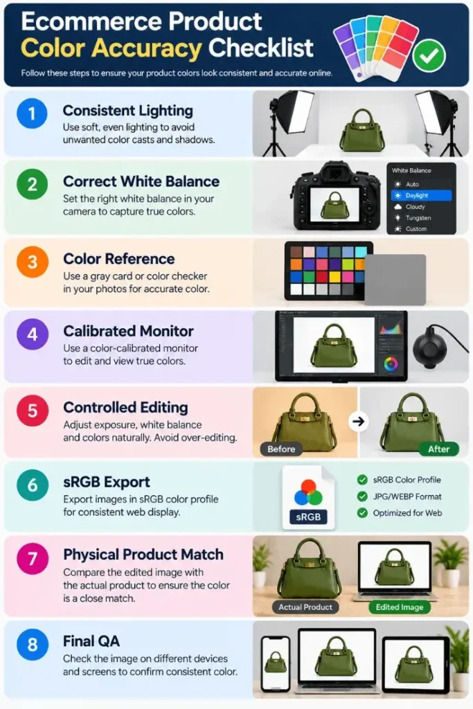
Use this checklist before publishing ecommerce product images. It helps identify common color problems across the photography, editing, and publishing workflow.
| Check | What to Verify |
|---|---|
| Lighting | Consistent and suitable |
| White Balance | Neutral and accurate |
| Color Reference | Color checker or physical reference |
| Monitor | Properly calibrated |
| Editing | No excessive saturation |
| Color Profile | Appropriate web profile |
| Product Match | Compared with the physical product |
| Catalog | Consistent across SKUs |
| Final QA | Checked before publishing |
A consistent checklist can help teams catch color issues before images go live. It can also make quality control easier when managing large product catalogs.
Frequently Asked Questions
What Is Ecommerce Product Color Accuracy?
Ecommerce product color accuracy refers to how closely a product image matches the actual product color. Accurate images help customers understand the product’s appearance before purchase.
Does Color Accuracy Affect Ecommerce Product Returns?
Yes. Noticeable color differences can create a gap between customer expectations and the delivered product. This may lead to dissatisfaction, exchanges, support requests, or returns.
Why Do Product Colors Look Different Online?
Product colors can change because of lighting, white balance, camera settings, editing, color profiles, and display differences. These factors can affect how the final image appears.
How Do I Make Product Photos Color Accurate?
Use consistent lighting, shoot in RAW when possible, and use a color reference. Calibrate your monitor, correct unwanted color shifts, export with a suitable web color profile, and compare the final image with the physical product.
What Causes Product Color Mismatch?
Common causes include incorrect lighting, white balance errors, excessive editing, inaccurate color profiles, and differences between display screens. Problems can occur at multiple stages of the image workflow.
Should Ecommerce Product Photos Be Color Corrected?
Yes. Color correction can help remove unwanted color casts and improve the accuracy of product images. The goal should be to represent the product naturally rather than create an artificial color.
Can Color Correction Help Reduce Product Returns?
It can help reduce color-related return issues by making product images more representative of the actual item. However, returns can have many causes, so color correction cannot prevent every return.
What Color Profile Should Ecommerce Images Use?
sRGB is commonly used for web images and ecommerce content. A consistent color workflow from editing through publishing can help reduce unexpected color differences.
Does Monitor Calibration Improve Product Color Accuracy?
Yes. A calibrated monitor provides a more reliable environment for judging colors during editing. It can help editors avoid making corrections based on inaccurate screen colors.
Need More Accurate Product Colors?
Accurate product colors help create clearer customer expectations. If your product images show unwanted color shifts, professional color correction can help. Get a free quote for accurate and consistent product colors, with up to 50% off on bulk orders.